Modelling Epidemic Curves Without the Cloud: The Science Behind the SIR Model in Excel VBA
The Mathematical Foundation of Epidemic Modelling
The history of mathematical epidemiology is, in many respects, the history of our ability to anticipate and contain infectious disease. From the foundational work of Kermack and McKendrick in 1927 to the sophisticated agent-based models deployed during the COVID-19 pandemic, the mathematical description of epidemic dynamics has evolved considerably — but its core logic remains rooted in a deceptively simple framework: the SIR model.
The SIR model divides a population into three compartments: Susceptible (S), individuals who have not yet been infected and remain at risk; Infected (I), individuals who are currently infected and capable of transmitting the pathogen; and Recovered (R), individuals who have recovered and are assumed to be immune. The dynamics of the system are governed by two parameters: the transmission rate (β), which determines how quickly susceptible individuals become infected upon contact with infectious individuals, and the recovery rate (γ), which determines how quickly infected individuals recover.
The ratio of these two parameters — β/γ — yields the basic reproduction number R₀, one of the most important quantities in all of epidemiology. When R₀ > 1, each infectious individual generates more than one secondary infection on average, and the epidemic grows. When R₀ < 1, the outbreak declines and eventually extinguishes. The critical threshold of R₀ = 1 represents the boundary between epidemic growth and epidemic control.
How the Epidemic Calculator Model Implements the SIR Framework
The Epidemic Calculator Model Excel VBA Dashboard, available at https://hatchery.gumroad.com/l/avtmsi, implements the SIR framework within a Microsoft Excel workbook using Visual Basic for Applications (VBA). This implementation makes the mathematical machinery of epidemic modelling accessible to any user with a copy of Excel, without requiring knowledge of programming languages, differential equation solvers, or statistical computing environments.
The dashboard allows users to specify four core inputs:
| Parameter | Description | Example Value |
|---|---|---|
| Initial Population (N) | Total size of the population being modelled | 10,000 |
| Infection Rate (R₀) | Basic reproduction number of the pathogen | 2.5 |
| Recovery Rate (γ) | Proportion of infected individuals recovering per day | 0.1 |
| Days of Simulation | Duration of the modelled outbreak | 100 |
Once these parameters are entered, the VBA engine numerically integrates the SIR differential equations across the specified time horizon, computing the daily values of S(t), I(t), and R(t) — the number of susceptible, infected, and recovered individuals on each day of the simulation. These values are then rendered as a dynamic epidemic curve chart, providing an immediate visual representation of the outbreak trajectory.
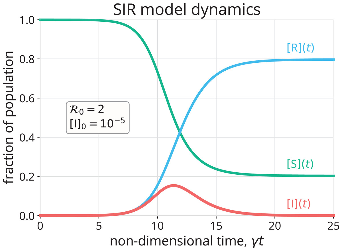
Reading the Epidemic Curve: What the Visualisation Tells Us
The epidemic curve generated by the dashboard is one of the most information-rich outputs in all of applied epidemiology. Its shape encodes a wealth of information about the dynamics of the outbreak and the likely effectiveness of different intervention strategies.
A sharp, tall peak in the infected compartment indicates a highly transmissible pathogen (high R₀) with a rapid recovery rate — the classic pattern of influenza or measles in an unvaccinated population. The steep rise and fall of the curve reflects the rapid depletion of the susceptible pool as the epidemic burns through the population.
A broad, flat curve — the epidemiological ideal captured in the phrase "flatten the curve" — indicates either a less transmissible pathogen or the effect of interventions that reduce the effective reproduction number. The total number of infections may be similar, but they are spread over a longer time horizon, reducing the peak burden on health systems at any given moment.
The susceptible depletion curve — the S(t) line — tells us about herd immunity dynamics. When S(t) falls below the threshold N/R₀, the epidemic begins to decline even in the absence of interventions, because the probability of a susceptible individual encountering an infectious individual has fallen below the level required to sustain transmission.
Simulating Interventions: The Power of Parameter Adjustment
One of the most valuable features of the Epidemic Calculator Model is the ability to adjust parameters in real time and immediately observe their effect on the epidemic trajectory. This makes it an exceptionally powerful tool for exploring the potential impact of public health interventions before they are implemented.
Reducing the infection rate — for example, by modelling the effect of mask mandates, social distancing measures, or contact tracing programmes — is equivalent to reducing the effective reproduction number R_eff below R₀. In the dashboard, this can be simulated by reducing the R₀ input and observing the resulting change in the epidemic curve. The difference between the baseline curve and the intervention curve provides a quantitative estimate of the lives saved and hospitalisations averted by the intervention.
Increasing the recovery rate — for example, by modelling the effect of antiviral treatment that shortens the infectious period — can similarly be explored by adjusting the γ parameter. In pathogens where treatment shortens the infectious period, this can have a substantial effect on R_eff even without reducing transmission per contact.
Vaccination can be modelled by reducing the initial susceptible population S(0) to reflect the proportion of the population that has been immunised prior to the outbreak. This allows users to explore the relationship between vaccination coverage and epidemic outcomes, and to identify the coverage threshold required to prevent epidemic growth.
From Excel to Epidemiological Literacy
The broader significance of the Epidemic Calculator Model extends beyond its immediate utility as a modelling tool. By making the SIR framework accessible in a familiar, interactive format, it has the potential to substantially improve epidemiological literacy among health workers who may never have encountered mathematical modelling in their training.
Understanding the SIR model — even at an intuitive level — fundamentally changes how a health worker thinks about outbreak response. It transforms abstract concepts like "herd immunity threshold" and "flattening the curve" into concrete, manipulable quantities with observable consequences. It builds the kind of quantitative intuition that is essential for making sound public health decisions under uncertainty.
The Epidemic Calculator Model Excel VBA Dashboard is available at https://hatchery.gumroad.com/l/avtmsi and represents a significant contribution to the goal of making epidemiological science accessible to every health worker, everywhere.
Reference
Epidemic Calculator Model EXCEL VBA Dashboard — An offline SIR-based epidemic simulation tool built in Excel VBA, enabling real-time epidemic curve visualisation and intervention scenario modelling for public health professionals. Available at: https://hatchery.gumroad.com/l/avtmsi